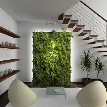
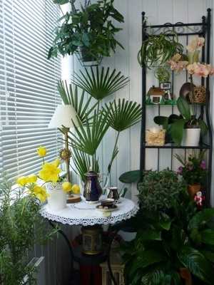
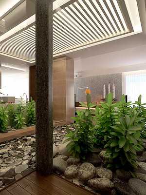
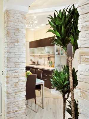
 The phytodesign basics offered in this material will help you understand the basic principles. You can see the phytodesign in the photo, which shows various options for decorating the premises. Flowers help to create phytodesign due to their unique decorative properties. However, when designing phytodesign with your own hands, it is worth considering the peculiarities and botanical characteristics of plants. If you take into account all the basics and rules, then the phytodesign of the house will turn out to be beautiful and functional.
Indoor flowers and design
Indoor flowers in the design are used taking into account the appearance of the foliage of indoor plants. The shape describes the size and shape of the sheet, texture indicates the physical nature of its surface, and the pattern indicates the distribution of color. The range of forms is enormous – from tiny leaves of soleurolia to 60 cm wide monstera leaves, from whole croton leaves with even edges to the feathery foliage of asparagus. The range of texture is also wide – it can be smooth, prickly, matte, shiny, velvety, crimped, etc. Finally, the drawing – the leaves are completely green, variegated (green and one other color), multi-colored, with veins, and so on. The combination of shapes, textures and patterns in the composition will make it more interesting, but too many different types of plants in a group can lead to chaos.
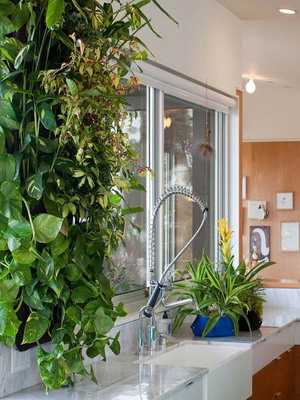
The unity of the design of indoor flowers (with photo)
Unity means that the different design elements of indoor flowers merge into a harmonious whole. This does not mean that the result should be boring and uninteresting. Place blood red anthurium in a stainless steel cylindrical container against a stark white wall in a modern interior and you get contrast, but there is also a unity of modern forms and surfaces. On the other hand, a small palm tree in a colored ceramic flowerpot on a piano in a provincial room is different in shape, color and size, but there is also unity here. There are set of rules that can help with this, but the simplest is to ask yourself two questions: does the plant look in its place in this container, and does it fit into the room?
There are two aspects to the concept of balance. The first one concerns plants or plants together with a pot. Physical balance is needed here, which means that the container must be heavy enough to prevent the one-sided composition from tipping over. In addition, there must be visual balance. This means that a physically stable composition should not look as if it could tip over. You can add weight to the lighter side of a visually unbalanced composition by using plants with large, dark leaves. The second aspect of balance concerns the visual interaction of two nearby objects, which can be quite different in style. To determine if they are balanced, imagine them on giant scales – if one side clearly outweighs the other, then there is no balance.
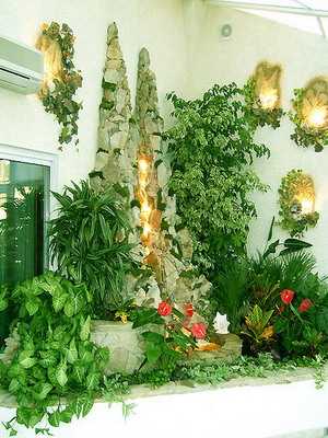
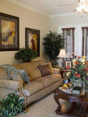
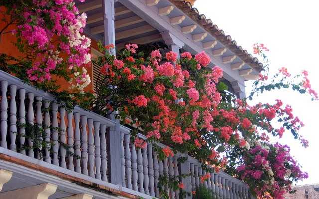
Next, you can see the design of indoor flowers in the photo with examples of layouts:
Colors and shades
Warm colors and shades brighten the composition. Pure tones of warm colors are often very catchy and distract the eye from cold colors. Dark and light shades of them look more restrained.
White itself has a calming effect – when placed next to warm colors, it will make them look brighter.
Cool colors make the composition calm. Their clean tones are also restrained and create a sense of serenity, but they pale against a backdrop of vibrant, warm colors.
In a monochrome (one-color) scheme, different tones and shades of the same color of flowers and / or non-green areas of leaves are used.
In a similar scheme, two, three or four colors of flowers and / or non-green areas of leaves that are adjacent in the color wheel are used.
In contrasting schemes, two colors of flowers and / or non-green areas of leaves are used, which are located on the color wheel opposite each other.
In polychrome (multicolor, or rainbow) schemes, colors of flowers and / or non-green areas of leaves from any different parts of the color wheel are used.
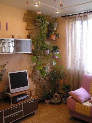
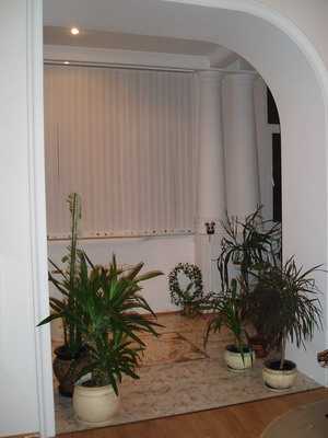
The correct design with indoor flowers and its photo
Proportionality is the combination of the size of the plant and its container with the size and shape of the room and its furniture. The goal pursued by the design with indoor colors, in this case, is to ensure the proportionality of these combinations. A tall and sprawling palm tree in a small hallway can look out of place, while separate pots with small plants spoil the look of a large modern room.
There are no exact rules for ensuring proportionality, but there are general principles. If you are dealing with a large, free area, choose a large outdoor tree plant – a medium-sized plant can just get lost. A specimen with a wide spreading crown or drooping leaves can visually lower the ceiling, and a tall columnar plant will, on the contrary, increase the apparent height of the ceiling.
Don’t buy a large plant for your room on impulse. Measure the height and width of the space provided, and take a tape measure in your garden center to find a plant that fits the bill.
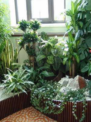
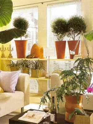
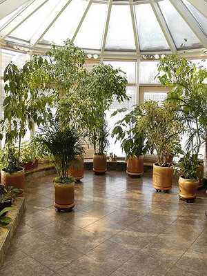
Look at the correct design of indoor flowers in the photo, which illustrate the principles indicated above:
The golden ratio. This term is used to describe a ratio of 1: 1,618. It has been used since ancient times to create visually pleasing effects in buildings, paintings, landscaping, interior design, and more. About 2500 years ago, it was found that this ratio underlies many proportions in the human body. Later it was found that the same applies to flowers, trees, shells, etc. Then this proportion was applied to art – the ratio of width to length of the Parthenon in Athens corresponds to the golden ratio, and it can be found in works of art from the XNUMXth to the XNUMXst century.
In phytodesign, we can use a simplified version of this formula. In simple terms, this means that if the plant is 1,5 times taller than its neighbor, then the effect will be pleasing to the eye. If you are covering a portion of the wall area with plants, try doing it in a rectangular shape with one side 1,5 times longer than the other. Sometimes, due to its ideal balance, the golden ratio gives objects an excessive rigor, and this rule is not absolute and obligatory.
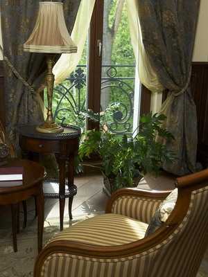
Any technique or material that makes the eye move from one part to another gives dynamics to the composition. The first thing to do is make sure that the two or more plants that you acquire for the group composition stand out enough to act as focal points. Focal points, to which the eye turns and lingers there for some time, in the composition should be separated. The flowers and leaves used should not create an even, uniform surface over a large area.
Curved lines are very important – notice how the ampelous plant in the composition in the photo above makes the eye move from one element to another. No plant should be so dominant that it distracts the eye from other plants in the group for a long time – use it as a single specimen.
Contrast
Unity and contrast are seemingly opposite design ideas, but they are not. Unity means that the plant should fit into the overall look of the room – there should never be a feeling that it does not belong to it. In the plant / container / background combination, however, there should be some degree of contrast. This means that there must be a noticeable difference between one or more of these elements.
The degree of contrast between the plant (s) and the pot (s) is a matter of personal taste, but there are some points to remember. A green plant in a green pot may look dull, but using brightly colored or patterned containers will distract attention from the plant. While there is no need for a high degree of contrast between the plant and the pot, there should be a clear contrast between the plant and its background – white is ideal, but other pastel shades will work as well.
Placing a multicolored houseplant arrangement on a patterned background is a design mistake. Against the background of such wallpaper or curtains, a composition should be placed in which large green leaves dominate.


: description, photo and secrets of cultivation")


")


